In collaboration with ReFINEd Kingston Magazine.
See more of my published work and articles in the magazine on my
Work With Me page.
Ah, the flat lay. What is it and how do you style one?
These days it’s a social media staple. But it’s been around in the world of print and magazine publishing for quite some time. If you’ve never seen one (you probably have and just aren’t aware it has a name) you can search #flatlay on just about any social media platform and you’ll see plenty of examples. But in short, it’s an image of products beautifully laid out on a flat surface and photographed from a birds-eye-vie. But there’s more to it than just tossing stuff on a table, snapping a photo, and calling it a day.
With a few considerations and design strategies in mind, anyone can create a stunning display that will stop that scroll. I’ve got a few tips for creating the perfect flat lay so you can make your own and see those Instagram comments (as likes don’t really matter anymore) roll in!
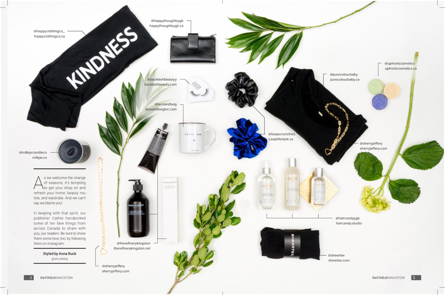
Photo by Stephen Wild Photography.
Why Create a Flat Lay?
If your goal is to feature products as the star of the show, a flat lay is the best way to achieve this. There are no distractions in the photo to draw the eye elsewhere. Yes, you could simply take a quick snap of your products from the front, but it won’t be as stylistically or visually pleasing as a flat lay. Creating a flat lay provides you with an opportunity to incorporate branding into the image through colour, design, and overall feel.
A flat lay allows you to not only showcase your products, but creates opportunity to encorporate branding into your image.
If you’re a maker or a brand who sells any kind of product line, a flat lay is a fantastic way to create brand awareness for your business. By displaying the packaging or label, viewers will begin to recognize and identify with your brand when they see it. Additionally, it provides an opportunity for viewers to appreciate the quality and craftsmanship of your work in detail.
When I was asked to create a flat lay (which actually turned into two, more on that later) for ReFINEd Kingston Magazine, I approached the project like I would any styling session, highly strategically. Except this time my goal wasn’t to make the model look their best in the clothing, it was to showcase the provided products in a stylized way that aligned with the aesthetic of the magazine.
Start with a White Background
If you’re thinking white sounds a bit boring, think again.
White is bright yet neutral. So it is the perfect way to reduce background noise while drawing the eye where you intend it to go (to the stuff on top of the background of course). You want your image to tell a story, and you don’t want a busy background to distract from that story. White allows the products to shine as the focus of attention.
Your flat lay should tell a story. You don’t want a busy background to distract from that story. A white background allows the products to shine as the focus of attention.
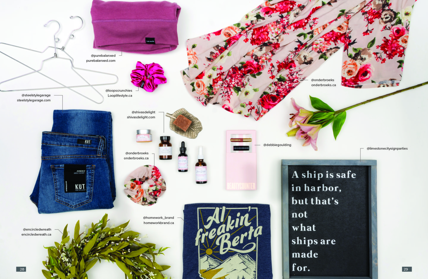
Photo by Stephen Wild Photography.
Want to see the behind-the-scenes from this flat lay photo shoot? Check out this video on Instagram and Facebook.
You don’t need anything fancy! Any white surface will do (for our ReFINEd Kingston Magazine flat lay we used a big roll of white paper). Should you really not like the idea of a white background or don’t have any solid white surface available, consider purchasing this contact paper that has a faux marble appearance. You can use it as your background or mount it to any solid surface if you plan on using it repeatedly. It will add a bit of detail to your background without drawing attention away from the featured items.
Use Proper Lighting
As with most photography, indirect natural light is best. You don’t want to shoot right in the sunshine as you’ll create shadows and could run into issues with your camera’s exposure settings. Pick a location that’s bright, but not directly in the light for the best results.
If you want to see what happens when you don’t follow this advice, I’ll swallow my pride and link you to this blog post (my first or second one ever, over 5 years ago). We all start somewhere, and I’ve learned a lot since then!
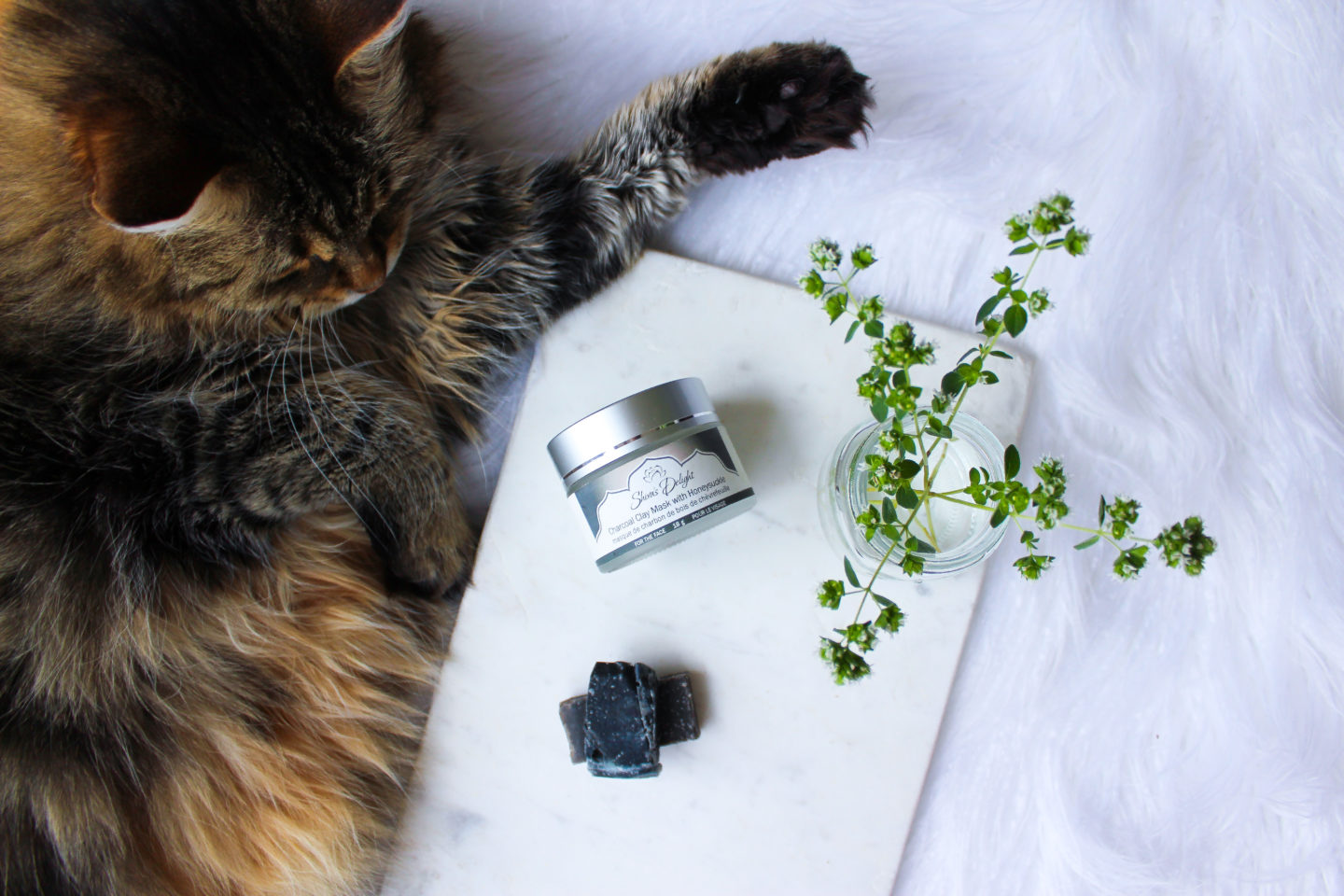
I used a faux sheepskin rug, and marble slab, and somehow managed to get my cat to cooperate for this shot. She was featured again here in another flat lay!
Sort Products into Groups
When I arrived at the photoshoot and saw the featured products the first thing I did was remove the packaging (where applicable) and sort the items into groups. This helped me to determine whether we were shooting one flat lay, or multiple. I piled them together based on their colour and aesthetic. We had a lot of products that were monotone and worked well together, and others that were colourful and floral. So, two flat lays emerged. One that is largely black and white with a few complementary pops of colour, and a second that is colourful with reemerging tones of blue and pink throughout. The end result is pleasing to the eye as all of the products in each image work in tandem to achieve an overall cohesive look.
Consider the Angle and Direction
It may take some experimenting to see what you like best, but that comes with the territory when designing a flat lay. Remember, styling this kind of image is a creative endeavor so it may take some trial and error before you arrive at something you love.
As you layout out products, think about whether you’d like to have them shot from directly above or at a slight angle. The standard is to shoot from above, but you don’t absolutely have to snap your photo dead on. It depends on your products and how you’d like them to be perceived. Shooting at an angle may make a bottle appear longer, and can create focus if you’d like one particular item to stand out from the rest.
Remember, styling this kind of image is a creative endeavor so it may take some trial and error before you arrive at something you love.

You can see another angle from this same shoot in this Instagram post.
Tidy vs. Chaotic
Do you prefer that the products be lined up straight and parallel to one another or that they appear strewn about casually? What about placing them diagonally? This creates more depth of space. Which sounds most appealing to you?
Before you decide, consider which style is more fitting for your brand. If you’re not sure play around with the layout as you go. Whatever you do, make sure your flat lay doesn’t look messy. If you prefer a more chaotic look, strive for curated and purposeful chaos.
If in the midst of it you find yourself struggling, step back for a moment and focus on the white space instead of the products. How much white space is there? Are there gaps between each product or are too many layered on top of one another or too close to each other? Seeing things in the reverse may help you determine the next steps.
Considering white space and how much of it is visible in your image is also important if you want to include text afterward in post-production (as we did for this ReFINEd Kingston Magazine photoshoot). Try to visualize where exactly you’ll be able to insert text as you’re laying out products so you don’t end up with nowhere to put that text after the fact.
Consider whether or not you’ll be adding text in post-production while you’re styling the flat lay. That way you can ensure you’re leaving enough white space in between products and have logical places to insert text later.
Take Photos Throughout
Take lots of photos as you reorganize and shuffle items around so that you have various final options. Things often look different once you see the final product on your computer or phone. You may not notice that something is out of place until you see it on a larger screen. If you’re lucky, you’ll also have smart creative people around to chat it through with, like I did with the ReFINEd Kingston Magazine team (thanks to Cathie the Publisher, Stephen the Art Director, and to my favourite photoshoot assistants, Breanna and Ashlynn, Cathie’s lovely daughters).
Two images from the same shoot for this sponsored social media post, edited slightly differently.
Taking various photos throughout provides you with different image options in the end without having to set up your shoot a second time.
Taking test shots as you move things from one place to another leaves you with various options from one photo session, so you’re not setting it all up again later. This may also come in handy if you’re running a contest and want to have a few photos ready to promote entries multiple times.
Take lots of photos as you move items around. You may not notice something is out of place until you see it snapped, and you’ll have more image options in the end.
Utilize Props
Props make your flat lay more interesting! But of course, don’t include other products that compete with yours. If you’re a jewelry maker, don’t include other jewelry as props. Instead, include things like plates, coasters, string lights, magazines or prints, cups, vases, mugs, and hangers. It depends on what products you’re shooting! Try to incorporate pretty things or household items. I keep a stash of decorative things (some that may otherwise go into the recycling) in my office for flat lay shoots and when it comes time to style one, I pull everything out to play.
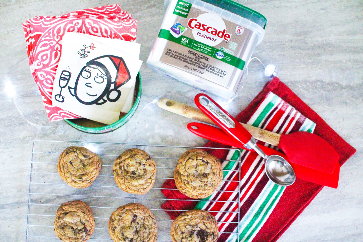
I utilized twinkle lights, cooking utensils, and red and green items as they not only coordinated with the branding for Cascade, they also aligned with the holiday season.
You should also consider including props that are shiny. Light will bounce off of them and create a little bit of iridescent magic in your final image. For the ReFINEd Kingston Magazine flay lay photoshoot, you can spot vintage decorative plates, hangers, and coasters that I included for this purpose. I sorted these shiny props based on whether they were silver or gold and used them together in one image instead of mixing and matching. This resulted in a more cohesive final look.
Oh, and if you’re wondering how anyone gets those round bottles to stay in place for a flat lay shoot, the secret is clear tape. Always bring it along with you! You can keep it with your props to ensure that your bottles are secure and always facing the right way.
The secret to keeping those round objects in place? Clear tape. You can keep some stashed away with your props so you have it on hand.

I ended up using a different image to promote this sponsored Instagram post from the same photo session.
Include Greenery & Nature
I suppose this isn’t a hard and fast rule for a flat lay, but it is something I practice. There is something about a flat lay that includes a little bit of greenery that always gets my attention. That being said, it is dependent on your product and brand. For example, if you’re creating a flat lay of sports memorabilia, greenery may not be appropriate.
But I love including greenery and nature whenever I can. Perhaps its the balance this provides between the products and these natural elements, but for me adding greenery is a must. Before I style a flat lay, I always make sure I have a bouquet at the ready. I may utilize flowers or just greenery, but this way I have options.
If you have faux florals in your home, this can also work in a pinch. But, be warned that close up these can sometimes look fake. I recommend purchasing a cheap floral arrangement (one of those $10 grocery store bouquets works wonderfully) for this purpose.
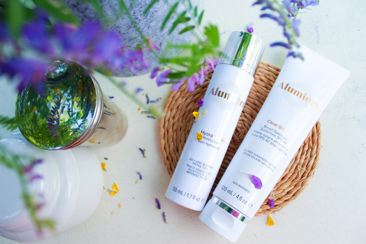
Without the florals and greenery, this image would be pretty boring! Here’s a look at another angle.
I have produced dozens of flat lays for social media! Check out this post for Febreze, lipsticks by TON Cosmetics, hair products by Design.ME Hair, a watch by Daniel Wellington, lip chap by Epic Blend, and a variety of local products for Lumina Borealis to name a few.
Tag Featured Brands
Now that you’ve created something you love and are ready to post it on social media, don’t forget those tags! I spoke in detail about the power of the tag tool in my recent blog post, 5 Social Media Mistakes you Might be Making, but if your image contains other brands, tag them!
People love to see their products featured by others, and will likely reshare them, extending your reach and audience. If your flat lay is solely focused on your products and you’re squeamish about including others, consider adding unrelated products as props. These can be items created by others who aren’t in the same niche or market as you, so you’re not featuring competitors. Add in a pretty scarf made by a fellow local maker if you sell candles, or a funny mug if you create jewelry. This will not only jazz up your image, but allow you to tag these brands, increase your impressions, and also support businesses you love and purchase from. It’s a win-win!
Extend your social media reach by tagging brands included in your flat lay, just be sure not to make any of these 5 social media mistakes!
Finally, remember to have fun when you’re creating a flat lay. As a content creator and social media consultant, I’ve noticed people often feel intimidated if they’ve never attempted a flat lay. My best advice is to just start. Starting is often the hardest part! Get near a window, grab a white surface, stand on a chair, and start snapping. And if you pick up a tip along the way, be sure to share it with me on Instagram, Facebook, Twitter, or let me know in the comments below.
Want to see these tips in action? Watch the video below!
Oh, and before you hit publish and post your own flat lay, be sure to tag me @struckblog so I can repost your creation! I’d love to share them on my social channels.
Happy creating!
Anna
Disclosure: Thank you to ReFINEd Kingston Magazine for creatively including me in yet another issue!
Would you like help creating social media/web content (maybe even styling a flat lay?). STRUCKBLOG offers a variety of creative and promotional services. Visit my Work With Me page to check out previous work and to download a copy of my Media Kit for pricing and details.
All opinions and comments are my own. STRUCKBLOG uses affiliate links. For more information about this and the use of sponsored products please see my disclaimer page.

